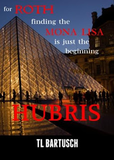
Designing Book Covers for the Roth Series
 |
| The base image I used today to create a new cover for Hubris. Wikimedia Commons |
Overkill you say. You bet, but it's not easy to conceptualise a story in a cover design. I've used a number of images to try and give my reader the idea of what's in this book which is a mystery/thriller about the theft of the Mona Lisa from the Louvre. Of course the painting itself would be the first thing you think of and I did, I used it but I wasn't happy with the result.
As the book is set in the curatorial department of the museum I also tried an image of the workshops in the Louvre. I liked that. It was primarily black and white and appealed to my sense of what the story is about. Alas, after a few weeks I fell out of love with it because it wasn't talking and decided to start again.
The issue was eye appeal - that design and colour that catches your reader's eye and says 'you have to look at me. Don't miss out'. For that, black and white is good but colour can pack more oomph. The photograph I decided on today couldn't be more different to my last two attempts - it's a night shot, primarily golden and graphic. I also used colour in the type, rather than black or white or a combination of the two.
The other thing I managed today is to compose what I hope is an illustrative hook - that condensed form of words that appears on the cover and makes your reader want to read the story.
Here are the three latest versions of the cover for Hubris.
 |
| 1/3 |
 |
| 2/3 |
 | ||||
| 3/3, today's version and hopefully the last |


Comments
Post a Comment